fbpx

Di20 Design and Architecture, graphic design, packaging design, branding, store design

Complete packaging redesign project for the Modo Leve natural products line, including jam reformulation and development of new labels for juices and tomato sauce, focusing on optimized readability and modern minimalist aesthetics.

HISTÓRICO DO PROJETO

DEFINIÇÃO
Complete label redesign for jams and development of new healthy products for the Modo Leve brand.
DIVULGAÇÃO
Small and medium markets, premium natural stores, and digital strategy through social media.
REQUISITOS
Logo in prominent position on packaging with clear "zero sugar" identification on the front face.
OBJETIVO
Label development with optimized readability and visual elegance to facilitate reading for older audiences.

THE DIAGNOSIS
Our analysis revealed three crucial points:

Low brand readability on existing packaging
Lack of visual hierarchy that hindered quick product identification
Outdated design that didn't reflect the brand's premium positioning

STRATEGIC TYPOGRAPHIC INNOVATION
The logo typography was completely reformulated to occupy less area in length, resulting in:

Better layout of mandatory information
Greater brand prominence, especially on small labels
Optimized visual hierarchy for quick reading
Application flexibility across different packaging sizes

INTELLIGENT COLOR SYSTEM
Colors were strategically used to assist in distinguishing the flavors of each product. The combination with dark secondary color gives the label an aspect of greater sophistication and quality, specifically attracting the health-conscious target audience.

THE TRANSFORMATIVE RESULTS
Renewed Jam Line
The jams gained a new visual identity that perfectly balances:

Elegant minimalism with clear information
Premium prominence that justifies quality positioning
Intuitive identification through exclusive pictograms

EXCLUSIVE MINIMALIST PICTOGRAMS
To follow the desired minimalist style, a complete pictogram system was developed to assist in identifying each flavor, providing more modern design and efficient visual communication.

THE MARKET IMPACT
Modo Leve's transformation exemplifies how strategic redesign can:

✅ Increase visibility at the point of sale
✅ Elevate product value perception
✅ Facilitate expansion into new categories
✅ Strengthen brand identity in the premium market

THE INITIAL CHALLENGE

When Modo Leve approached us, they faced a common but critical problem: their healthy, high-quality products were getting lost on shelves. Despite ingredient excellence and production care, their packaging didn't adequately communicate brand values or attract consumer attention in the competitive natural products market.

THE REDESIGN STRATEGY

Key Words That Guided the Project

We defined five fundamental pillars to guide the entire creative process:

  • 🌿 Natural - Connect with the organic essence of products
  • 🍯 Tasty - Awaken appetite through design
  • 👑 Premium - Elevate quality perception
  • ✨ Prominence - Ensure point-of-sale visibility
  • ⚡Quick Reading - Facilitate instant identification

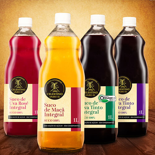
EXPANSION TO NEW PRODUCTS

The success of the jam redesign paved the way for developing three new labels:

  • Natural juice line
  • Artisanal tomato sauce

Each product maintains brand visual coherence while expressing its unique personality.

VEJA MAIS NOTÍCIAS
RELACIONADAS