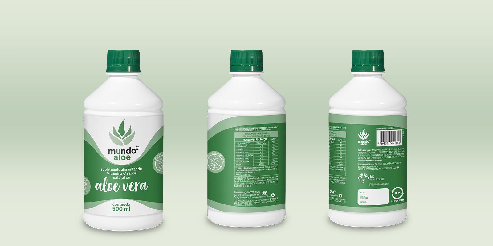
INNOVATIVE SINUOUS DESIGN
The label design was developed to highlight the sinuous shape of colors, while the white dots provided continuity to the bottle's shape, transforming into a complete and balanced design.
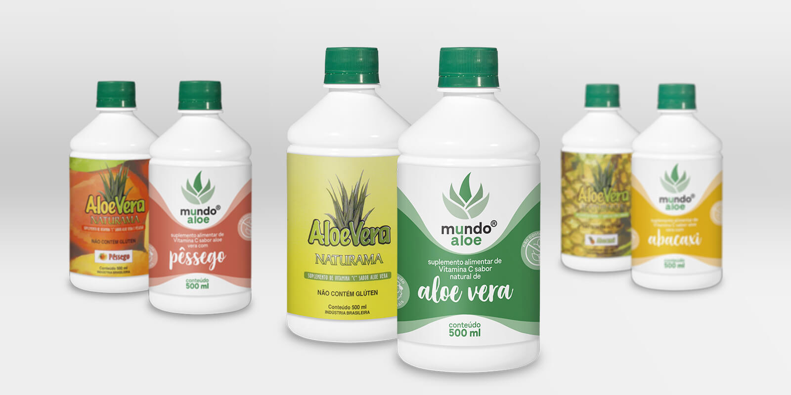
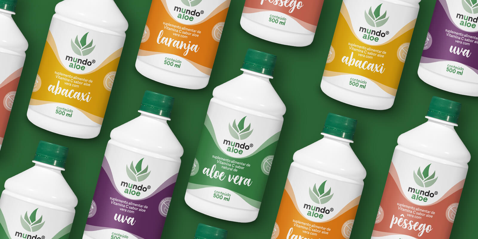
STRATEGIC CHROMATIC SYSTEM
For each flavor, new colors were developed that would draw more attention at the point of sale. The new design is extremely modern, simple, and functional, solving the main problems of the old labels:
- Information disorganization was eliminated
- Element confusion was simplified
- Visual hierarchy was optimized
DI20 METHODOLOGY IN ACTION
- Limitations Analysis - Study of technical restrictions (existing bottle) to create creative solutions
- System Development - Creation of scalable visual identity for future lines
- Functional Optimization - Design that combines modern aesthetics with practical functionality
RESULTS AND IMPACT
Proven Performance:
- Greater brand credibility in the supplements market
- Modern and functional design that stands out from competition
- Scalable visual system for product expansion
- Cost optimization maintaining existing bottles
- Clear communication of Aloe Vera differential