Di20 Design and Architecture, graphic design, packaging design, branding, store design

Natural Packaging Design with German TraditionStrategic visual renovation project for Juréia's human food line, combining German tradition with functional modernity through artisanal illustrations, vibrant colors, and sophisticated natural design that highlights the premium character of the products.

HISTÓRICO DO PROJETO

DEFINIÇÃO
Complete layout renovation of Juréia's human line packaging, maintaining the brand's traditional essence while modernizing visual communication.
DIVULGAÇÃO
Broad audience: Classes A, B, and C through supermarkets, gourmet stores, and specialized retail points for natural products.
REQUISITOS
More vivid colors with greater visual presence; strategic use of illustrations on packaging for greater food prominence; differentiated chromatic system where each package has a specific associated color.
OBJETIVO
Maintain the consolidated natural product image but gain prominence and modernity in the competitive premium food market.

SOPHISTICATED NATURAL DESIGN STRATEGY
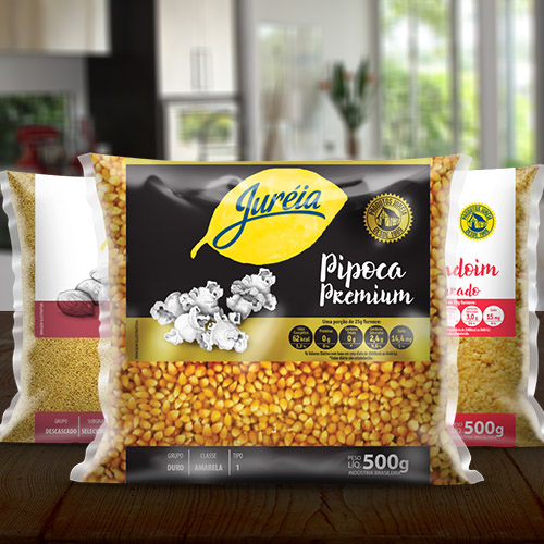
Juréia's new packaging was meticulously developed with the objective of highlighting the natural character of its products through visual elements that communicate authenticity and superior quality.

VISUAL CONCEPT: MODERN GERMAN TRADITION
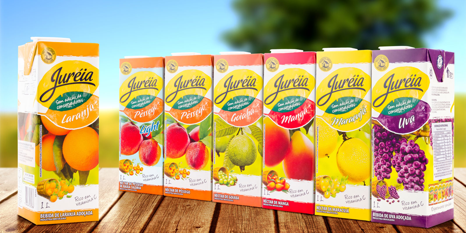
Brand Emotional Aspect: Natural, responsible, modern, organic, committed to the customer and superior quality.

DIFFERENTIATED VISUAL ELEMENTS
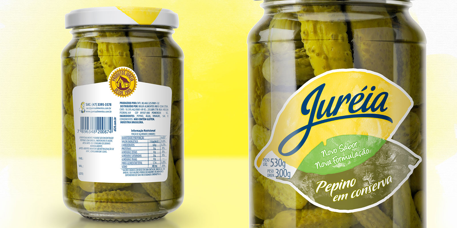
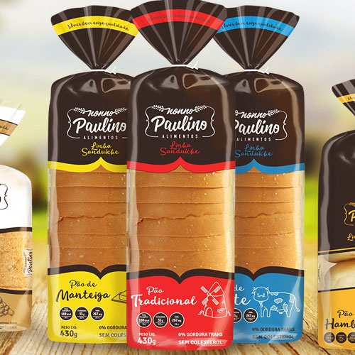
The German house, a characteristic and iconic brand element, was reformulated as a tradition seal, adding premium value to the packaging and reinforcing the brand's heritage.

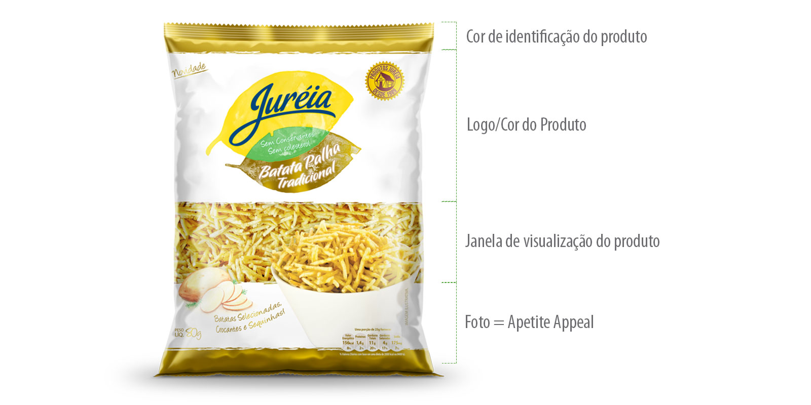
STRATEGIC ORGANIZATION
The packaging's informational structure was optimized to facilitate immediate brand identification and its categories, creating efficient visual hierarchy.

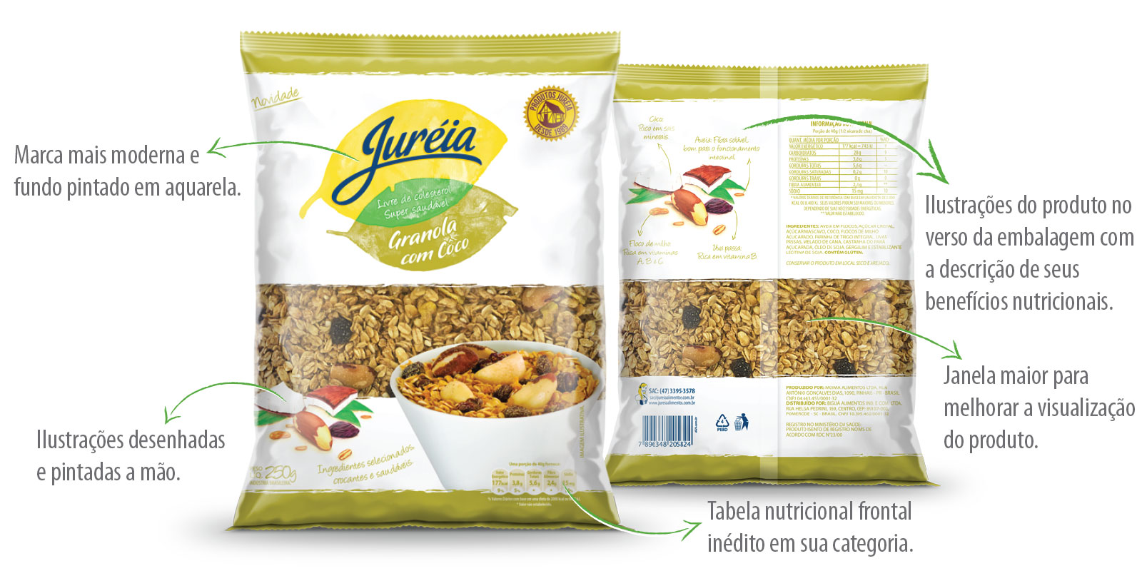
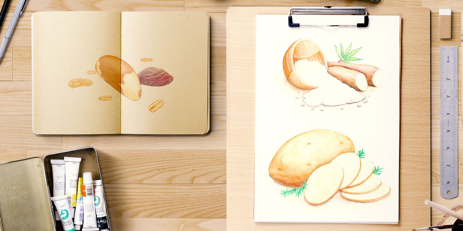
EXCLUSIVE ARTISANAL ILLUSTRATIONS
The hand-made illustration specially developed for each product provides the touch of class and sophistication to the packaging, differentiating from competition through artistic personalization.

Naturalistic Technique: To highlight the natural character, handwritten fonts, hand-drawn and painted illustrations, and irregular strokes that communicate artisanal authenticity were used.

PACKAGING DEVELOPMENT

The current brand was maintained and received greater visual prominence. The printed area was reduced in order to increase the window for product visualization, allowing consumers to see the quality of the content.

Benefits of the New Design:

Product name gained more prominence Natural properties have better visualization More vivid and impactful colors Use of white background communicates refined and natural product Optimized prominence of Juréia products at the point of sale

DI20 METHODOLOGY APPLIED

  1. Heritage Analysis - Deep study of the brand's German tradition to preserve essential elements
  2. Artisanal Development - Creation of exclusive hand-made illustrations for each product
  3. Visual Optimization - Reorganization of information architecture for maximum point-of-sale impact

RESULTS AND IMPACT

Proven Performance:
  • Preservation of traditional German identity
  • Visual modernization without loss of authenticity
  • Greater point-of-sale prominence through vivid colors
  • Clear communication of natural and artisanal values
  • Premium differentiation in the preserves market
VEJA MAIS NOTÍCIAS
RELACIONADAS