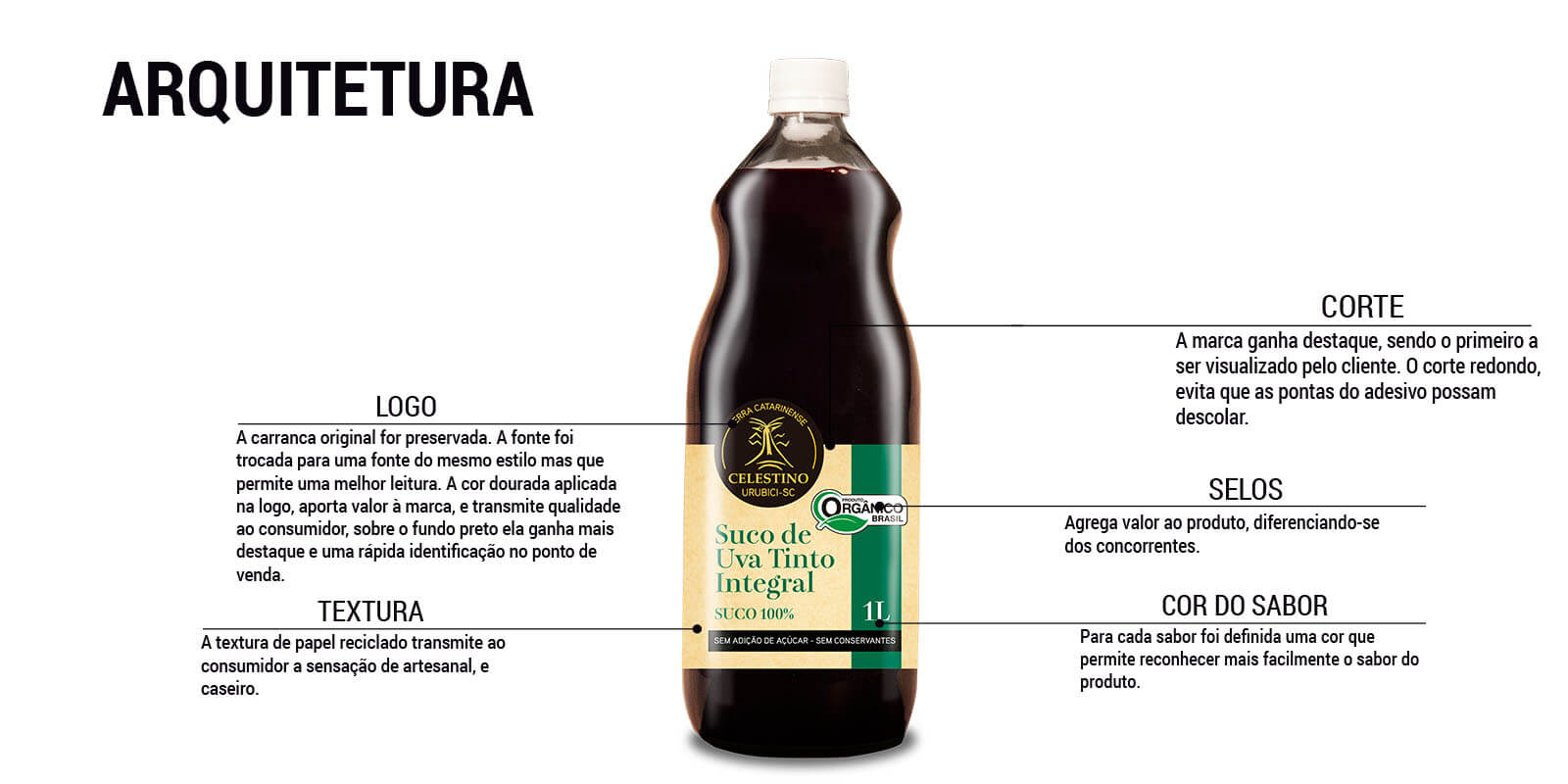
REGIONAL DESIGN STRATEGY
The project consists of redesigning integral juice packaging to add natural and healthy value for the target audience. Specific aspects were chosen to reinforce the homemade character:
- Recycled paper texture that communicates sustainability
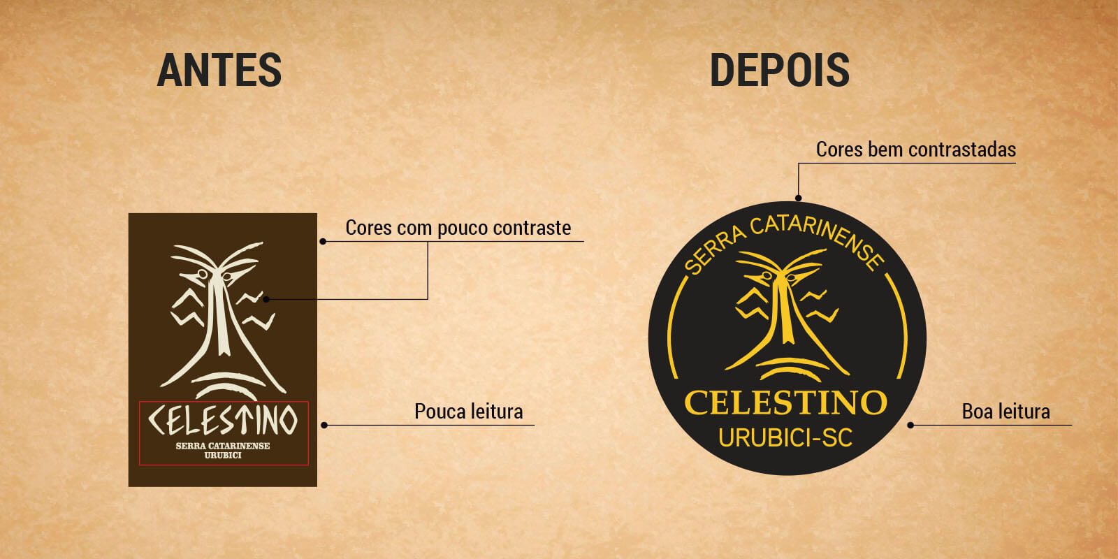
- Restructuring of the original carranca from the logo for more modern design
- Restructuring of the original carranca from the logo for more modern design
PREMIUM QUALITY ELEMENTS
Strategic use of visual elements conveys the product's superior quality:
- Recycled paper texture communicates sustainability
- Artisanal illustrations reinforce homemade character
- Chromatic contrast optimized for point-of-sale prominence
- Renewed typography for better legibility
DI20 METHODOLOGY APPLIED
- Heritage Preservation - Maintenance of traditional carranca as identity element
- Functional Modernization - Technical optimization of cut and application for durability
- Regional Differentiation - Integration of Santa Catarina Mountains values in design
RESULTS AND IMPACT
Proven Performance:
- Preservation of traditional regional identity
- Visual modernization without loss of authenticity
- Greater point-of-sale prominence through contrast
- Optimized functionality with durable round cut
- Clear communication of superior artisanal quality