Di20 Design and Architecture, graphic design, packaging design, branding, store design

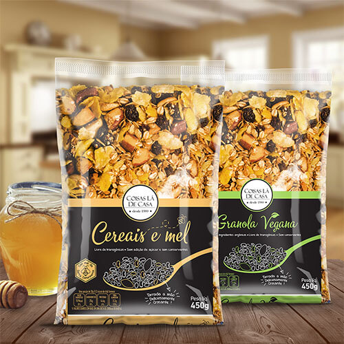
Creation of complete label system for over 45 natural products from the Naturessen brand, developed for maximum prominence in natural stores and alternative markets through vibrant colors, custom patterns, and modern layout that connects with fitness and vegan audiences.

HISTÓRICO DO PROJETO

DEFINIÇÃO
Extensive label creation project for complete Naturessen natural products line, including brand identity development and strategic naming.
DIVULGAÇÃO
Specialized market: natural stores, small organic product markets, e-commerce and alternative retail points focused on healthy eating.
REQUISITOS
Develop impactful labels through strategic use of bright and contrasting colors that ensure competitive prominence in specialized retail points.
OBJETIVO
Creation of modern and attractive layout that stands out significantly at the point of sale, effectively communicating natural values and premium product quality.

NAMING AND IDENTITY DEVELOPMENT
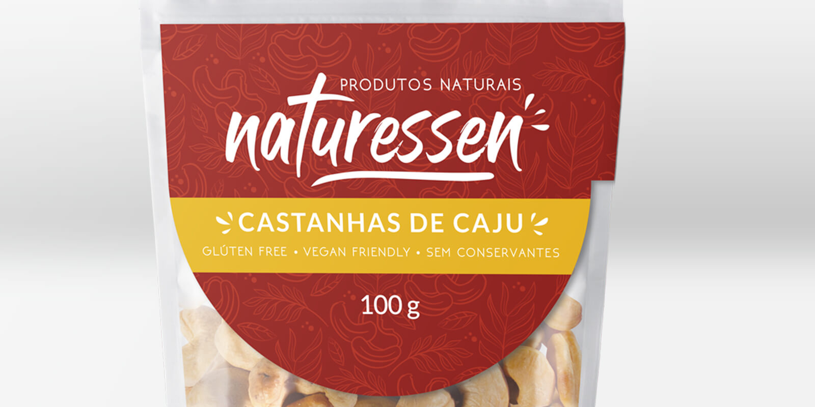
The project completely renewed not only the old logo layout but developed strategic naming for the brand. "Naturessen" directly refers to the natural origin of the product, creating immediate connection with brand values.

DIFFERENTIATED VISUAL SYSTEM
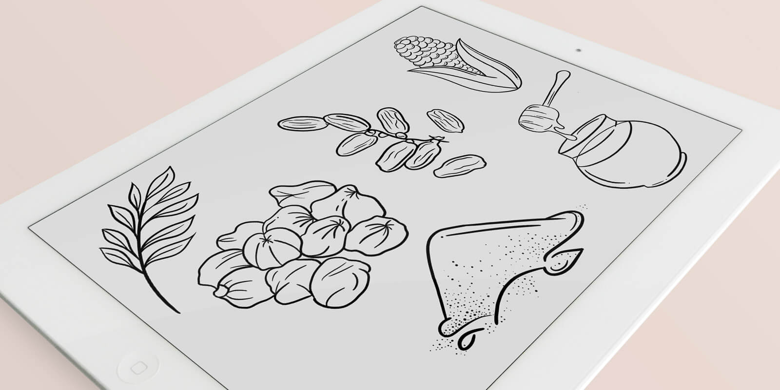
For each label, an exclusive pattern was developed to characterize the product:

Complementary products or different weights have interchanged primary and secondary colors
Contrasting and bright colors specific to characterize each product
Personalized digital illustrations that refer to the encompassed products
Unique patterns that facilitate quick identification

EXTENSIVE AND COMPLETE PROJECT
Comprehensive scope that included:

Over 45 different products
Development of personalized illustrations
Professional product photography session
Strategic color combination for each category
Creation of 2D mockups for e-commerce and promotion

VIBRANT DESIGN STRATEGY

The project's central objective was to highlight products at retail points through bright colors, custom patterns, and modern, attractive layout. The brand seeks to remain relevant and competitive among competitors, reinforcing the natural origin of products with greater visual appeal.

STRATEGIC TARGET AUDIENCE

Specific targeting for women who maintain natural and fitness lifestyle - people concerned with aesthetics and body health. The calls positioned just below the product name attract this specific audience, reinforcing quality and insertion in the gluten-free market and vegan trend.

MOCKUPS AND STRATEGIC PHOTOGRAPHY

A fundamental part of the project was professional product photography for creating realistic 2D mockups. This stage is relevant for illustrating the product in e-commerce sales and effective brand promotion in digital channels.
VEJA MAIS NOTÍCIAS
RELACIONADAS