Di20 Design and Architecture, graphic design, packaging design, branding, store design

Complete transformation of visual identity and packaging design for the traditional Big Giz brand, combining 50-year heritage with sustainable innovation and modern vintage aesthetics.

HISTÓRICO DO PROJETO

DEFINIÇÃO
Strategic brand redesign project and sustainable packaging development for Big Giz, leader in the school and professional chalk segment, focusing on point-of-sale differentiation and ecological values communication.
DIVULGAÇÃO
Premium distribution channels: specialized stationery stores, school supplies, educational retail points, and B2B e-commerce.
REQUISITOS
Preserve the brand DNA built over five decades, conveying history, reliability, and solidity while modernizing visual communication to connect with new audiences.
OBJETIVO
Develop a renewed visual identity that maintains the brand's traditional essence but incorporates modern vintage elements and sustainability, creating greater visual impact and competitive differentiation.

Big Giz's new visual identity was carefully developed to preserve 50 years of tradition while projecting the brand into the future. Through subtle and strategic changes, we managed to create a more modern and memorable brand, with strong vintage appeal that resonates with nostalgic consumers and experienced educators.

Strategic chromatic flexibility: The red and blue color system was expanded with monochromatic variations that allow greater application versatility across different backgrounds and contexts, reducing production costs without compromising visual impact.

Big Giz's new packaging represents a triple revolution: they are more visually attractive, offer greater brand prominence at the point of sale, and are significantly more economical and ecological.

Differentiated Visual Concept: The vintage design with cut-out elements simulates chalk drawn on a blackboard, where the blue background represents the board and the cut-out elements symbolize the chalk. This approach creates instant recognition and emotional connection with the educational universe.

Proven Sustainability:

100% recycled paper packaging
60% reduction in ink usage through chromatic optimization
Traditional line (white chalk): blue color only
Colored line: strategic red application
Point-of-Sale Performance:

Greater visibility on shelves through optimized contrast
Quick product identification through consistent visual language
Premium differentiation that justifies superior quality positioning

METODOLOGÍA DI20 EN ACCIÓN Este proyecto ejemplifica nuestra metodología exclusiva de alto impacto:

  1. Análisis Competitivo Profundo - Mapeo completo del mercado de material escolar e identificación de oportunidades de diferenciación
  2. Mood Board Estratégico - Desarrollo de panel visual con tendencias vintage-modernas y sostenibilidad como pilares centrales
  3. Diseño Único de Excelencia - Creación de una solución definitiva que combina tradición, modernidad y responsabilidad ambiental

Resultado: Aprovação imediata do cliente e implementação bem-sucedida em toda a linha de produtos, demonstrando nossa capacidade de entregar soluções que realmente funcionam no mercado real.

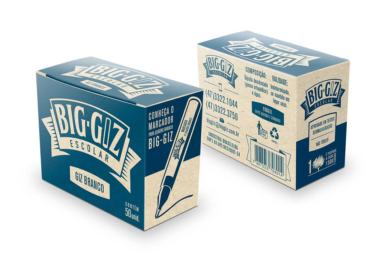
CASE DE ÉXITO: TRADICIÓN + INNOVACIÓN

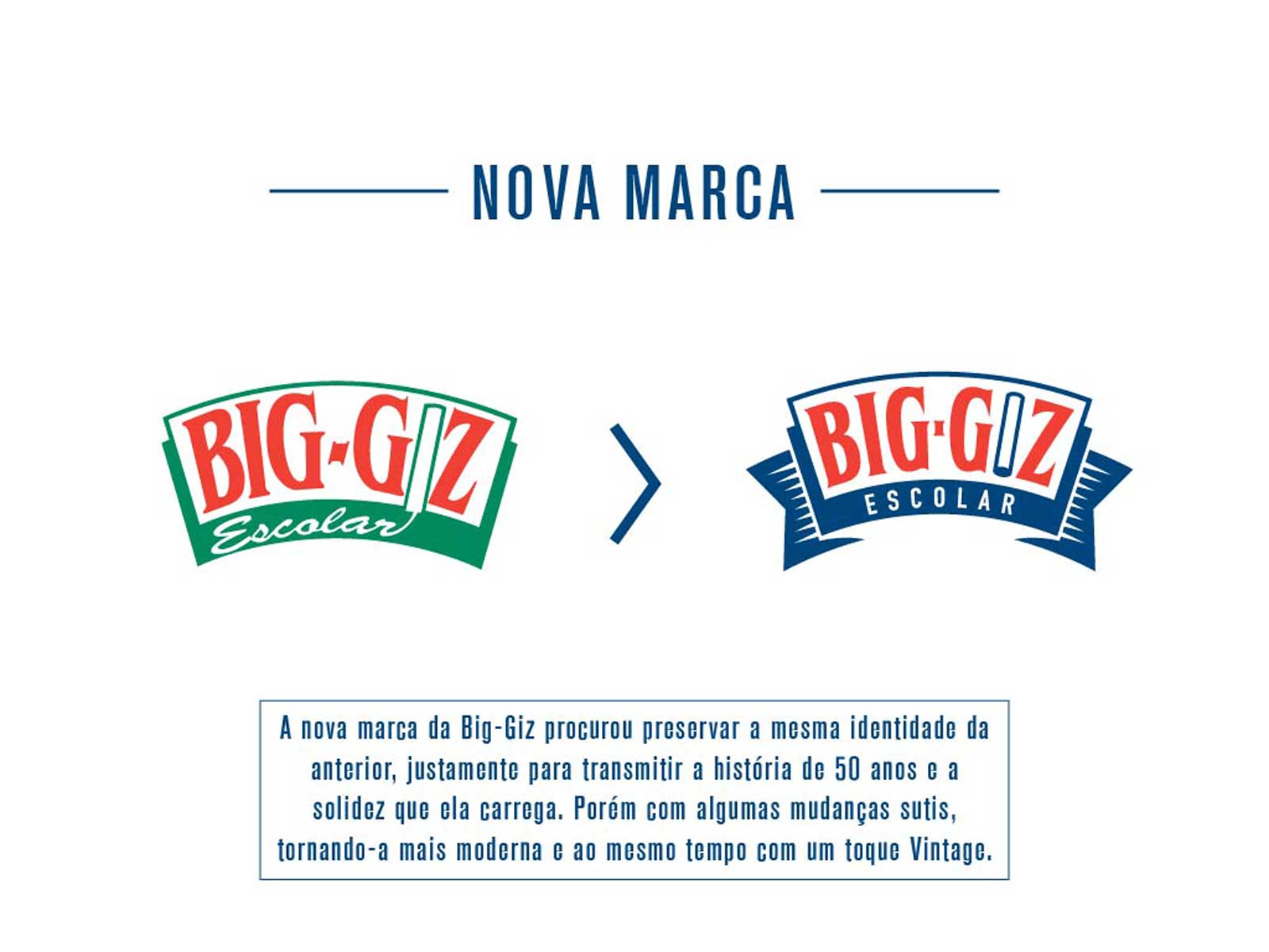
El rediseño de Big Giz prueba que es posible honrar la historia de una marca mientras se la prepara para el futuro. A través de diseño estratégico y sostenibilidad, transformamos una marca tradicional en referencia de innovación en el segmento educacional.

Principales Logros:

  • Preservación del heritage de 50 años
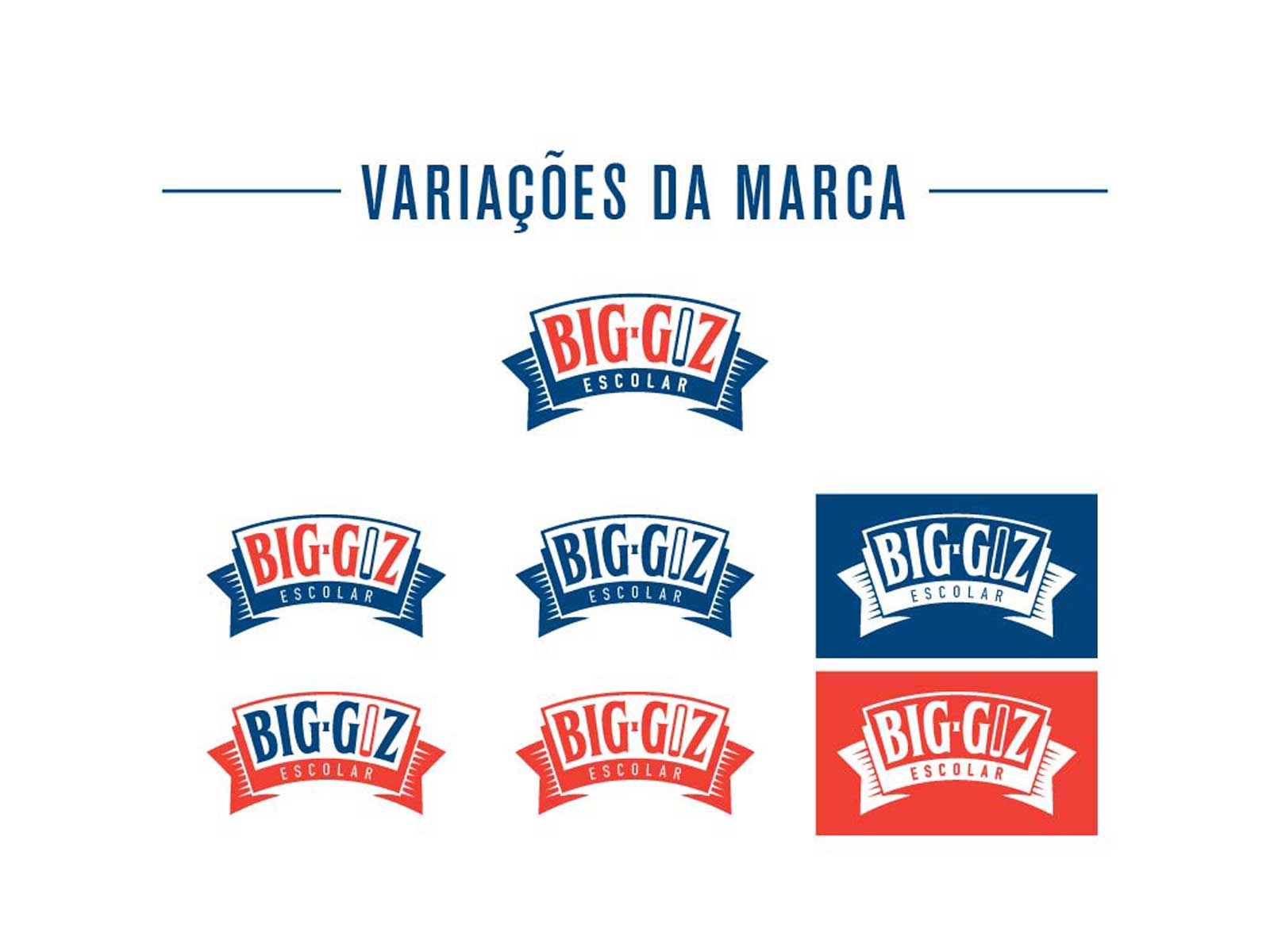
  • Modernización visual sin pérdida de identidad
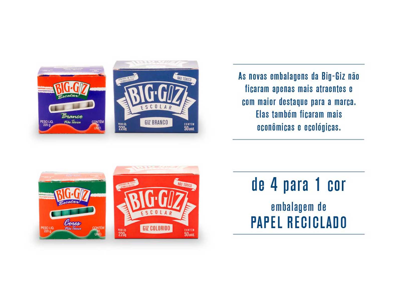
  • Sostenibilidad real con impacto mensurable
  • Diferenciación competitiva en el punto de venta
  • Flexibilidad de aplicación en diversos contextos
VEJA MAIS NOTÍCIAS
RELACIONADAS